In the world of the internet, “branding” is a term often thrown around like confetti – but what does it actually mean? To me, branding is the certain LOOK that a person, blog, or product has which makes it recognizable almost anywhere. Have you ever seen an ad for something and before the company name or product is revealed you just KNOW what it’s an ad for? That’s good branding, right there.
But why is branding important? And how do we brand ourselves so that we actually stand out in a crowd of people who are super similar? To answer the first question, branding is important because – if done right – it makes you recognizable. The people who don’t follow you yet might see your stuff circulating on social media, but they won’t usually recognize it as “HEY THAT’S SO-AND-SO” unless you have some kind of branding going on.
It works with geographical places, too – like Paris, for instance. What do you think of when you think of Paris? The Eiffel Tower, languages you don’t understand*, old paintings, and butter. < THAT’S THE BRANDING OF PARIS. You see where this is going, don’t you?
Branding mostly consists of BUT IS CERTAINLY NOT LIMITED TO: color schemes, font choices, styles, taglines, and mascots. All five of these things combine to create a specific aesthetic – YOUR aesthetic. And once you’ve nailed that particular look, all you need to do is stay consistent. In this post, I’m going to go over each of these four things and we’re going to figure out how to build a brand that is fresh, clear, and uniquely YOU. Let’s go!
*assuming, of course, you don’t speak French. I clearly only speak Formyself. 😉
CHOOSE YOUR COLOR SCHEME
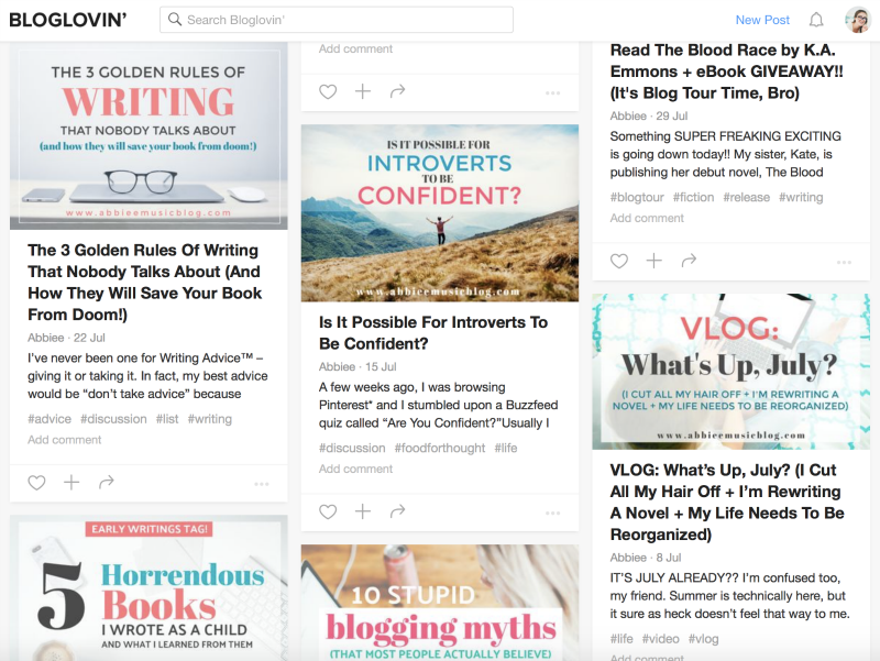
I’m listing color scheme first because IT IS SO IMPORTANT. Humans are super visual creatures and we associate things with colors more than we realize. For the past few months, I’ve been trying to stick to a specific color scheme (teal blue, coral pink, and gray) and I think it has HUGELY IMPACTED my chances of being recognized from a distance.
Take a look at my Bloglovin’ feed below. The last dozen posts on my blog follow this color scheme and therefore make it easier to spot my content among other posts from other blogs.
NOT TO SING MY OWN PRAISES* but this is a really good idea! Even though it might seem boring to make all your graphics look very similar, your readers will thank you** for it. Why? Because they will recognize your posts from a distance. They’ll see your graphics and be like “OH! THAT’S SO-AND-SO.” Just think of it this way: if for some reason a person couldn’t see ANYTHING but your graphic – no helpful text to tell them WHO posted this – would they be able to recognize it?
But this doesn’t just apply to images. It applies to literally anything you want. Your blog posts, too. Why not incorporate some color there? Insert images or dividers throughout your post that reflect your color scheme (ex: my teal watercolor dividers! hahaha NOT TO KEEP TALKING ABOUT MYSELF tho.) Color is one of the quickest and easiest ways to recognize a brand. And the best part is: there are NO RULES. What are your favorite colors? Pick two or three that you won’t get tired of. And then, the most important thing: STICK WITH IT.
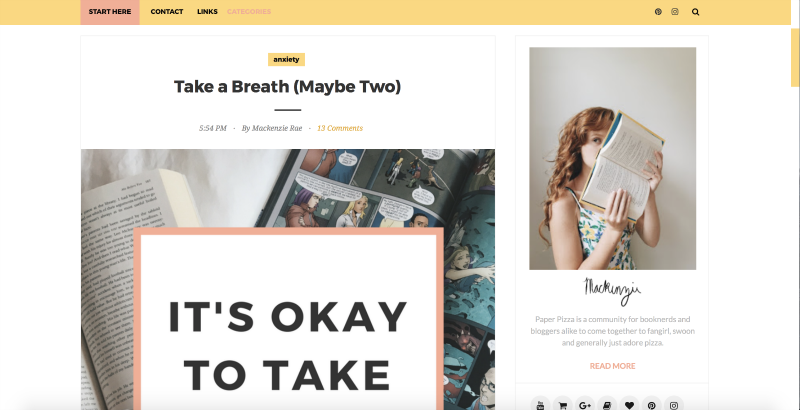
Another blogger I know who is totally KILLIN’ IT with color scheme is Mackenzie from Paper Pizza. (In fact, her whole branding game is epic!) If you aren’t familiar with her blog, what is wrong with you take a look at the screenshot below. Her color scheme is clearly yellow, with some peachy pink and mint green accents. It ties everything together and makes the space look clean and professional LIKE THAT. *snaps fingers*
*but you’re totally used to it by now because WHAT ELSE DO I DO AROUND HERE
**I MEAN THEY PROBABLY WON’T ACTUALLY THANK YOU because they won’t even notice what little psychological game you’re playing behind their backs muahahaha !!
PICK THE PERFECT FONT
There are no rules here, either. Except in the case of Comic Sans MS. For the sake of the world, your mother, and your second-cousin’s goldfish, PLEASE DO NOT USE COMIC SANS MS. Explore and have fun, but try not to pick fonts that will go out of style. How do you predict what will go out of style? HAHA. YOU CAN’T. But timeless fonts (like anything serif or sans serif) are always good choices. Think: EASY TO READ FROM A DISTANCE.
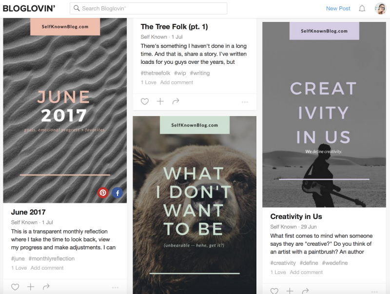
For an example of good font choice, I want to shoutout Rosie from Self Known. Not only is her branding on point, but her font choice is super rad, too. It’s consistent, clear, and easy to read from a distance.
Remember the reason why fonts exist: chiefly to make you READ THE WORDS. They can be pretty, but they ultimately have to be readable. This is why I’ve basically stopped using brush fonts. Not because they aren’t pretty (ON THE CONTRARY) but because it’s hard to read a brush font, especially from a distance. All caps sans serif is more my jam, now.* Pairing font with color is like killing two birds with one stone. Which is actually a rather stupid analogy when you think about it. Like bro I have NEVER seen a bird dumb enough to just sit there and be pummeled by a flying rock. Never mind TWO BIRDS in the same exact vicinity. Unless I’m totally misunderstanding this idiom? In which case, please enlighten me. I’d like to know the truth. OKAY MOVING RIGHT ALONG.
*WHEN IS ALL CAPS EVER NOT MY JAM?? THAT’S WHAT I WANT TO KNOW, RODNEY.
DISCOVER YOUR STYLE
AGAIN, NO RULES.* But this one might take a little longer than picking your colors and fonts. Because style is often developed, not chosen. It’s something that you happen to be. Of course, you CAN choose it if you want. You can adapt to any style you dream up, if that floats your boat. But I prefer to follow my heart on stuff like this.
What exactly do I mean when I say “style”? ANYTHING, REALLY. As a blogger, I would describe my style as:
- Optimistic
- Fun
- Inspiring
- ALL CAPS
- Footnotes
- Trademark Signs™
- Ridiculously friendly (I totally am, right?)
- Unschooled (in the best possible way)
- Multitalented
- FREE-SPIRITED NUTJOB
Your style, essentially, is what sets you apart from others. You don’t have to be TOTALLY DIFFERENT in every single regard. I mean, look at all the things I just listed! I know bloggers who have at least one of those traits. But I don’t know another blogger who has ALL TEN of them. That’s me. Hi!
What makes you unique is the combination of things – because the whole is greater than the sum of its parts. Think about any book you’ve ever read. Was there at least ONE element in the book that you’ve also read in another book? YES. Why? BECAUSE EVERYTHING HAS BEEN DONE BEFORE. But nobody is going to do your thing the same way you would.
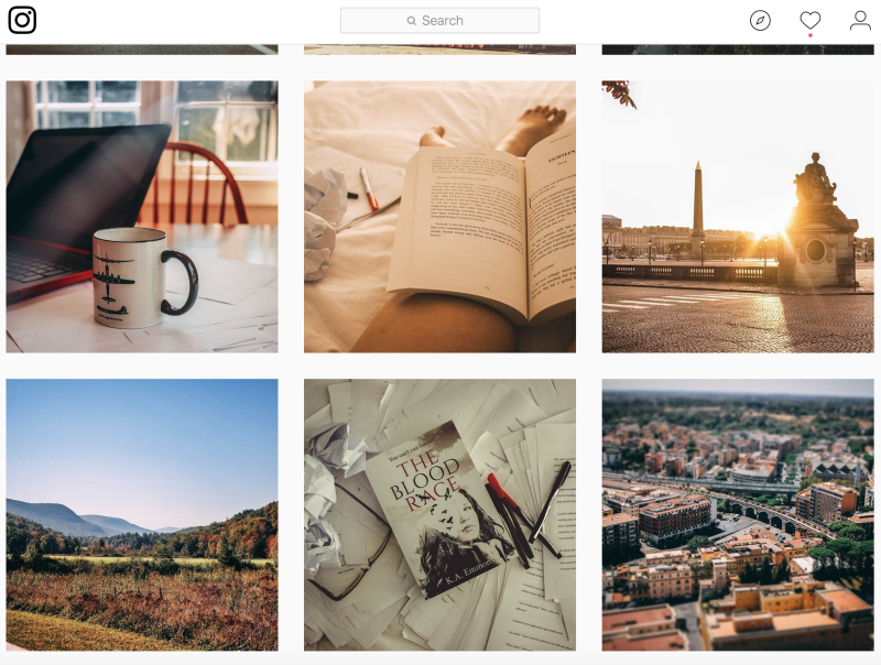
Let’s take, for example, Kate from The Goodness Revolt. (Go follow her if you don’t already!) I would describe her style as: golden, faded, poetry, inspiring, nostalgic, fiery, graceful, authentic, gritty, faithful. < SEE IT DOESN’T EVEN HAVE TO MAKE GRAMMATICAL SENSE. You need only to look at her Instagram grid to understand what I mean about Kate:
So this is how you discover your style: notice what you already do, and mix up all those traits into a beautiful soup to then serve your followers. Even if they steal the recipe for your soup and start serving it on their blog, too – DON’T BE DISCOURAGED. Be honored that someone thought you were epic enough to copy! And don’t worry about your uniqueness being stolen. Because guess what? IT CAN’T BE. Nobody else is you except for YOU.
*at this point I think it has become pretty obvious that I endorse rules roughly 0% of the time
FIND YOUR MASCOTS
Here’s where the fun part comes in! THE MASCOTS. No, I’m not talking about a giant stuffed animal suit that someone wears while they run around and shout your name from the rooftops – although that’s NOT A BAD IDEA?? I’m talking about anything that isn’t YOU… but that makes people think of you. It can be a place, a season, a food, a drink, an inanimate object…ANYTHING. YOU CHOOSE.
If you’ve been here on my blog for any amount of time, you probably know: my mascot is WAFFLES. In fact, I’ve been so closely associated with waffles that sometimes people literally mistake me for a waffle. THEY POUR MAPLE SYRUP ON ME AND ATTEMPT TO EAT ME FOR BREAKFAST. Well, not quite – but I have been properly crowned the Waffle Queen™ and I can’t even tell you how many people have sent me jokes and memes about waffles because THEY THOUGHT OF ME WHEN THEY SAW IT. Not to keep talking about myself, or anything…
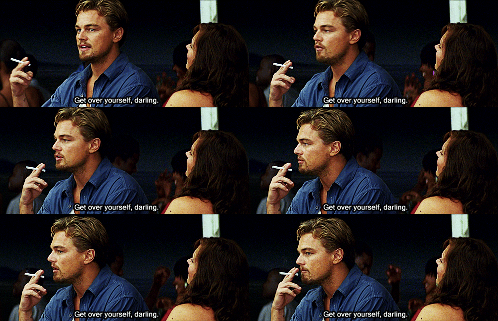 |
| BASICALLY EVERYONE @ ME |
This is just another great way to stick around in someone’s mind and life. If there’s an ordinary thing in THEIR life that reminds them of YOU…well then you just became a lot more connected. AND YOU DIDN’T EVEN HAVE TO TRY. All you did was have fun with your mascot(s) of choice.
I know quite a few bloggers who have mascots and it really helps to remember them and connect with them. For instance, I think of Mackenzie whenever I eat pizza! I think of Kate whenever I drink coffee! (which is never but that’s beside the point.) My point is this: if your mascot is a part of someone else’s life, it will remind them of you. And then they feel like YOU’RE THEIR LITERAL FRIEND. It works like magic.
CREATE AN EPIC TAGLINE
Taglines aren’t what you think. Taglines can singlehandedly reach through the screen of your computer, grab a potential reader by the throat, and pull them into your world where yOU ARE NOW MAGICALLY BEST FRIENDS. Why? Because taglines are supposed to cut right to the chase and deliver the definition of WHO YOU ARE AND WHAT YOU DO in one punchy sentence.
I recently read a super awesome article about writing your tagline and here’s how they summed it up: imagine you’re introducing yourself to someone for the first time. What do you say when they ask you, “What do you do?” Most people would simply reply with… what they do. But HOW BORING, right? “I’m a blogger.” Okay, so are lots of people. What makes you different? Instead of answering that boring question “What to you do?” Try answering these questions instead:
- What sets you apart?
- How do you help others?
- Who do you help?
- Why do you do what you do?
Once you’ve answered those four questions, scramble around your replies until they become a coherent introduction. One or two sentences is ideal. I sat down a few weeks ago and answered these questions myself. Here’s the tagline I came up with, which you can now find on my new and improved about page:
My name is Abbie Emmons and I help creative, multi-talented
people chase their dreams by making a living doing
something they love. This blog focuses on inspiration,
productivity, and the tools you will need to be a free spirit in
a world that wants to put you in a box.
A tagline is, essentially, a way to introduce yourself to a total stranger in one or two sentences. By telling them why you do your thing and who you help by doing your thing, you connect with your reader on a new level. You aren’t just a profession – you’re a person! You have a purpose and a passion behind what you do. So let that show. Let that be the conversation starter.
SO… NOW WHAT?
GO FORTH AND BUILD YOUR BRAND, OF COURSE! What are you waiting for?? You have all the tools. Of course, you can always find new ways to make your blog more recognizable in the crowd of similarities, but just the five things I talked about in this post will kickstart your branding adventures in AMAZING ways. Give it a try! AND FOR GOODNESS SAKE, HAVE FUN.
What do you think? Let’s talk about branding! Do you have a color scheme? If not, what would your color scheme be?? Do you have a mascot? (waffles are taken just fyi) What about a tagline? How would you describe YOUR style? Let’s chat in the comments!
rock on,
abbiee

